


学習データと推論データの分布がどのように予測に影響を与えるの?
データのタイプごとに分布を確認するには?

本記事ではそんな疑問に対してサンプルコードを添えてお答えします。
コンペなどで学習データと訓練データが与えられた際にそのデータの分布を確認することは予測精度を上げる際に非常に重要になってきます。
推論データに学習データに無い項目が多く含まれていた場合どれだけ学習データでモデルを訓練しても精度向上は見込めません。
しっかりとデータのタイプごとに分布を確認した上で対応策を考える必要があります。今回はその手法に関して紹介します。
それでは始めましょう!
本記事でわかること
- 機械学習コンペでのデータの事前確認方法
- ベン図を利用した学習/推論データの共通項を確認する方法
- 数値/カテゴリーそれぞれデータタイプでの分布を確認する方法
学習データと推論データの分布を確認する方法
データの分布を確認する方法として以下をサンプルコードと共に紹介します。
- matplotlib-vennを利用したベン図での学習/推論データの共通項の確認
- 数値/カテゴリーそれぞれのデータタイプでの分布の確認
サンプルデータのダウンロード
分布を確認するためのサンプルデータを以下からダウンロードします。今回はscikit-learnのcalifornia_housingデータおよびkaggleのtatanicデータを利用します。
#Calfornia hosing dataの読み込み
# サンプルデータ作成
data = sklearn.datasets.fetch_california_housing()
df_1=pd.DataFrame(data.data, columns=data.feature_names)

#データ分割
X_train_1, X_test_1, y_train_1, y_test_1 = train_test_split(df_1.iloc[:,:-1], df_1.Price, test_size=0.3, random_state=42)#Taitanicデータ読み込み
#サンプルデータ作成
titanic = fetch_openml(data_id=40945, as_frame=True)
df_2=titanic.data
#データ分割
train_2,test_2=train_test_split(df_2, test_size=0.5)matplotlib-vennを利用したベン図での学習/推論データの共通項の確認
matplotlib-vennを利用することで簡単にベン図を作成する事ができます。ベン図は各事象の複数の集合の関係や、集合の範囲を視覚的に図式化したものです。
今回はこのベン図を学習データと推論データで作成することで共通項とそうでない項をデータの項目ごとに可視化します。
まずはmatplotlib-vennをインストールします。
pip install matplotlib-venn以下のコードで学習データと推論データの分布を確認します。サンプルとしてtaitanicデータを利用しています。
def get_venn_plot(train: pd.DataFrame, test: pd.DataFrame):
    """show venn plot from train/test_dataset

    Args:
        train (pd.DataFrame): target_train_df
        test (pd.DataFrame): target_test_df
    """

    columns = test.columns
    columns_num = len(columns)
    n_cols = 4
    n_rows = columns_num // n_cols + 1

    fig, axes = plt.subplots(figsize=(n_cols*3, n_rows*3),
                                ncols=n_cols, nrows=n_rows)

    for col, ax in zip(columns, axes.ravel()):
        venn2(
            subsets=(set(train[col].unique()), set(test[col].unique())),
            set_labels=('Train', 'Test'),
            ax=ax
        )
        ax.set_title(col)

    fig.tight_layout()

get_venn_plot(train_2,test_2)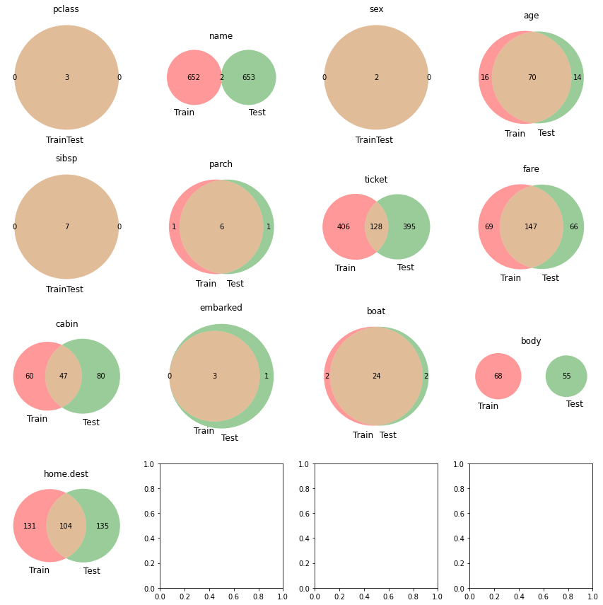
nameに共通項がほぼないことからtrain/testそれぞれのデータに同一人物はほぼいないことがわかります。ticketの種別はtrain/testで全く分布が異なるのでよく精査する必要がありそうです。
このようにベン図にすることで各項目ごとに簡単に学習/推論データの分布を確認することができます。
数値データタイプの分布確認
次に数値データタイプでの学習/推論データの分布確認の方法です。以下のコードでseabornのdistplotを利用して各データセットの分布を確認することができます。
サンプルとしてboston housingデータを利用しています。
def get_numeric_features_plot( train: pd.DataFrame, test: pd.DataFrame, cont_features: list, height, figsize,hspace=.3):
    """Show Numeric Features Distribution

    Args:
        train (pd.DataFrame): train_df
        test (pd.DataFrame): test_df
        cont_features (list): target_features
        height ([float]): plot_height
        figsize ([float]): plot_size
        hspace (float, optional): space of figs. Defaults to .3.
    """

    ncols = 2
    nrows = int(math.ceil(len(cont_features)/2))

    fig, axs = plt.subplots(
        ncols=ncols, nrows=nrows, figsize=(height*2, height*nrows))
    plt.subplots_adjust(right=1.5, hspace=hspace)

    for i, feature in enumerate(cont_features):
        plt.subplot(nrows, ncols, i+1)

        # Distribution of target features
        sns.distplot(train[feature], label='Train',
                        hist=True, color='#e74c3c')
        sns.distplot(test[feature], label='Test',
                        hist=True, color='#2ecc71')
        plt.xlabel('{}'.format(feature), size=figsize, labelpad=15)
        plt.ylabel('Density', size=figsize, labelpad=15)
        plt.tick_params(axis='x', labelsize=figsize)
        plt.tick_params(axis='y', labelsize=figsize)
        plt.legend(loc='upper right', prop={'size': figsize})
        plt.legend(loc='upper right', prop={'size': figsize})
        plt.title('Distribution of {} Feature'.format(
            feature), size=figsize, y=1.05)

    plt.show()


get_numeric_features_plot(train=X_train_1,test=X_test_1,
                        cont_features=X_train_1.columns,
                        height=5,figsize=12,hspace=.4)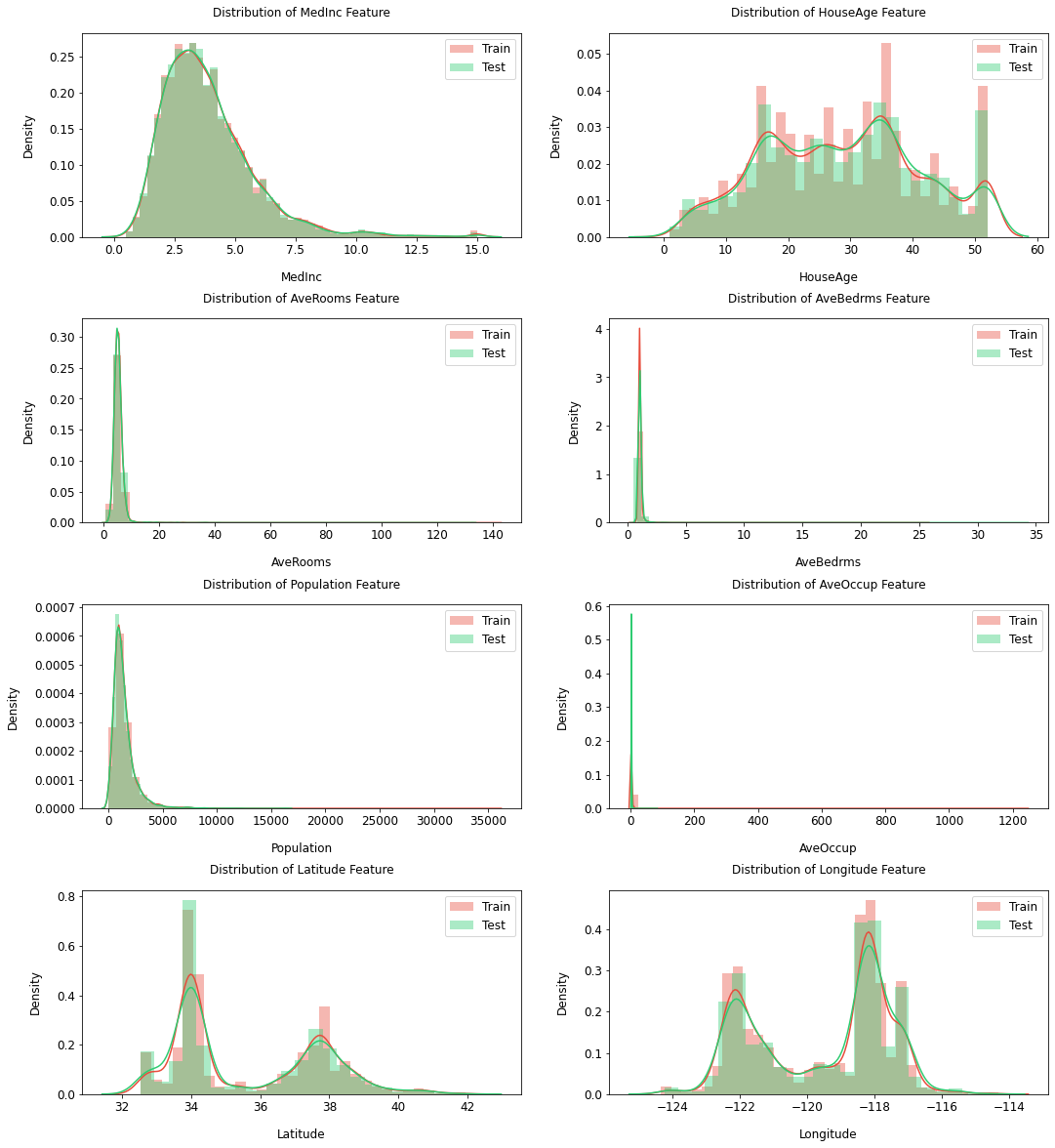
今回はランダムにデータを分割したためtrain/testでデータの分布が似通っていますが、時系列のデータなどを扱う際はドメインシフトを本方法で可視化する事ができます。
ドメインシフトとは?
ドメインシフトは学習データとテストデータの分布が一致しない状況を指す。このことにより機械学習の性能低下に繋がることがある。
[参考リンク]
https://www.mamezou.com/techinfo/ai_machinelearning_rpa/ai_tech_team/3
カテゴリーデータタイプの分布確認
次にカテゴリーデータタイプでの学習/推論データの分布確認の方法です。以下のコードでseabornのcountplotを利用して各データセットの分布を確認することができます。
サンプルとしてtitanicデータを利用しています。
def categorical_count_plot( train: pd.DataFrame, test: pd.DataFrame, cat_features: list, height, figsize, hspace=.3):
    """Show Numeric Features Distribution

    Args:
        train (pd.DataFrame): train_df
        test (pd.DataFrame): test_df
        cat_features (list): target_features
        height ([float]): plot_height
        figsize ([float]): plot_size
        hspace (float, optional): space of figs. Defaults to .3.
    """

    ncols = 2
    nrows = int(math.ceil(len(cat_features)/2))
    train["type"] = "train"
    test["type"] = "test"
    whole_df = pd.concat([train, test], axis=0).reset_index(drop=True)

    fig, axs = plt.subplots(
        ncols=ncols, nrows=nrows, figsize=(height*2, height*nrows))
    plt.subplots_adjust(right=1.5, hspace=hspace)

    for i, feature in enumerate(cat_features):
        plt.subplot(nrows, ncols, i+1)

        # Distribution of target features
        ax=sns.countplot(data=whole_df, x=feature, hue="type")
        ax.set_xticklabels(ax.get_xticklabels(),rotation = 90)
        plt.xlabel('{}'.format(feature), size=figsize, labelpad=15)
        plt.ylabel('Density', size=figsize, labelpad=15)
        plt.tick_params(axis='x', labelsize=figsize)
        plt.tick_params(axis='y', labelsize=figsize)
        plt.legend(loc='upper right', prop={'size': figsize})
        plt.legend(loc='upper right', prop={'size': figsize})
        plt.title('Count of {} Feature'.format(feature), size=figsize, y=1.05)

    plt.show()

#category itemの指定
cat_items=['sex','boat']


categorical_count_plot(train=train_2,test=test_2,
                        cat_features=cat_items,
                        height=5,figsize=12,hspace=.4)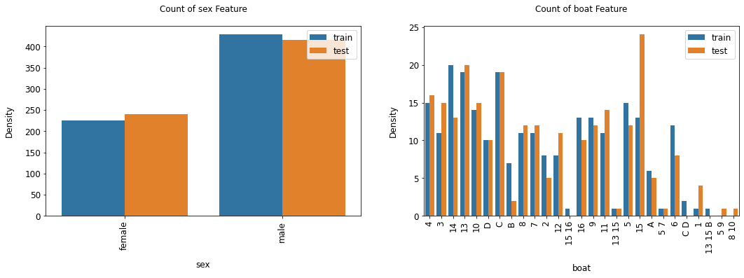
今回は数値データ同様データをランダムに分割したためtrain/testでデータの分布が似通っていますが、推論データにないカテゴリーなどがあった場合は学習データから削除するのも手です。
まとめ
今回は学習/推論データそれぞれのデータの分布を確認する方法を紹介しました。
無作為にデータをいじくり回す前にまずはデータ全体を俯瞰し、データへのアプローチをよく検討しましょう!
もっと詳しくPythonの使い方を勉強したいと思ったそこのアナタ!pythonを用いたコーディング学習にはData Campがおススメです!
詳細に関してはこちらで紹介しています。↓
こちらもぜひ参考にしてください。

それでは本日は以上でした!